16 Famous Line Art Logos That Actually Stand Out
Line art has been trending long before it had a name. Often the simple lines hid furtive messages and illusions few could see.
With time, line art made its way into corporate branding and company logos began to have clean, bold lines. Sometimes, with no resemblance to real objects. BUT they were clever enough to stir the imagination and memories of vaguely familiar items.
Today, this combination represents multi-billion-dollar businesses with unforgettable logos. Some are intentionally provocative, although many would deny subliminal messages.
Let’s take a look at sixteen line art logos that have aged well from four different categories.
Figurative line art logos
These are icons fashioned from different styles of lines to represent an object in real life.
1. Versace
Beautiful but terrifying, shocking yet captivating. It’s a brand flavor that no other symbolic figure can represent better than Medusa.
The Versace logo is designed with black lines on a white background to create amazing contrast. Medusa’s head itself is extremely detailed for an illustrative logo. And rare.
Today, it is no wonder that Versace is a brand that many have fallen irreversibly in love with.
2. Nestlé
Nestlé uses contrasting line art to depict a nest with two young birds being fed by their mother. The icon makes clever use of negative spaces to stand out.
As Nestlé means ‘little nest’ in German, the logo creates a visual link between the founder’s name and the company’s infant cereal products.
3. Australian Made
The Australian Made logo is a mark of Aussie authenticity. Made of only 3 very well-placed lines, it is simple and clearly represents the Land Down Under.
Although it might not be familiar to many of us, 99% of Australians recognize this label. And appreciate what it stands for.
4. Innocent

The brief was, ‘we just need a face with a halo above it’. The designer doodled it and within seconds, the brand had a face.
The Innocent logo is the result of handmade line drawing. The strokes have different weights to give the brand (and the fruit juices they sell) a warm, ‘homemade’ feel that’s appealing.
Typographic line art logos
These are based on inspiring font types. The lines shaping the letters are the only elements present to express the brand’s values.
5. Cadbury

The Cadbury wordmark is made of one continuous line to symbolize melting chocolate.
It was initially used as a secondary logo. And there were no less than 6 different ‘classic’ logos before William Cadbury’s signature is said to have been adopted as the primary logo.
Sometimes, a brand already has an identity. It just needs a bit of refinement.
6. Volkswagen
Volkswagen is another logo that relies on typography.
Its initials, V and W, are positioned ingeniously in a circle to make a strong symbolic impact.
The flat style with only two different line weights gives the logo a bold appearance that’s instantly recognizable.
The VW logo has had a few facelifts. The current logo looks more like the one from 1978 than the three-dimensional versions from 2000 - 2019.
7. Coca-Cola

Probably one of the oldest and most iconic logos to use typographic line art.
When naming the beverage, Frank M. Robinson figured that double Cs would make a strong impact in advertising. With that in mind, he designed the famous Coca-Cola script logo.
Although in existence for over a century, the logo has not changed much. The simple, swirly logo has proven to have an eternal quality, almost as if Robinson had anticipated it.
8. McDonald’s

To the uninitiated, this classic logo represents French fries bent into the shape of an ‘M’. To the rest, this is the unmistakable shape of breasts.
In fact, the logo designer persuaded McDonald’s executives that the breast-shaped arches would send a subliminal message to lure in customers. After all these years, could anyone argue?
The Golden Arches are made of one line with the base of the icon thicker to represent stability. It’s simple and recognizable by virtually anyone on the planet.
Typographic line art logos with figurative references
Logos that fall in this category are typographic in nature but also contain figurative representations.
9. Tour de France

One quick glance and it’s just a few words and dots arranged playfully. But closer inspection will reveal a brilliant disguise.
The O and the R are line illustrations of a wheel and a cyclist. The front yellow wheel symbolizes the sun as the race only takes place during the day.
10. Pinterest
Pinterest, a beloved image-sharing platform utilizes minimalist line art in its logo.
Since users ‘pin‘ what ‘interests‘ them on the platform, both elements form an integral part of this brand’s identity.
The smooth and elegant single-letter is shaped from one continuous line to represent an iconographic pin.
Pinterest is not the only brand with a stylized P for a logo. Path, a mobile messaging startup, also had a very similar logo. At one point, Path even tried to prevent Pinterest from acquiring the trademark to the letter P.
11. London Symphony Orchestra
The London Symphony Orchestra icon may have been formed with one line. But it’s not without an interesting twist.
The initials L, S, and O are quite obvious. But an orchestra conductor with a baton in hand might not be.
Yes, a single line can convey a lot when it’s aligned with a vision. For LSO, this vision did not stop with the logo. Real conducting movements were later motion-captured to create extraordinary promotional materials for the brand.
12. Beats by Dre

The Beats by Dre logo could be just a typographic ‘b’ on a red circle. But it’s not.
The white continuous line is also the image of a headphone in side view. Since it’s an audio products brand, this was no coincidence.
The logo has smooth edges and is definitely imaginative. It’s well-known all around the globe even if it curiously resembles the logo of Stadt Bruhl, a German city.
Abstract line art logos
The lines in these logos convey a message or just a spirit without presenting anything figurative.
13. Airbnb
The Bélo, as Airbnb calls its new logo, is made of one single line of uniform thickness. It is simple and composed of rounded edges, straight obliques, and a loop in the middle.
But simplicity does not make it shallow. On the contrary, there are 4 related symbols within the logo. The letter A, an inverted heart, a person, and a geolocation pin.
When it was announced in 2014, many ridiculed the Bélo, pointing out the sexual undertones in the design.
One theory is that it was intentional. Except they were more discreet than the folks over at McDonald’s!
14. Renault

Just one year ago, Renault unveiled a new, geometric version of its logo. This flat design comprises two intertwining diamond shapes, without a wordmark or any shading.
It may be simple, but according to the brand’s design director, Gilles Vidal, it is the symbol of the future. It strikes a balance between brand recognition and the brand entering a new era.
The line creates the impression of continuous movement forward. And Renault has certainly been moving forward. Back in 1919, it constructed armored vehicles during WW1. The brand logo at the time was a tank and they kept it for four years.
15. Olympic
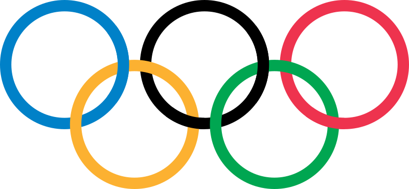
A minimalist line art logo recognized the world over. A symbol of solidarity.
Five interlaced circles indicate the meeting of athletes and the union of five continents.
Pierre de Coubertin, the founder of the Olympic Games, created the original logo and it’s very similar to the version we see today. The colors were chosen to represent every nation’s flag without exception.
16. Nike
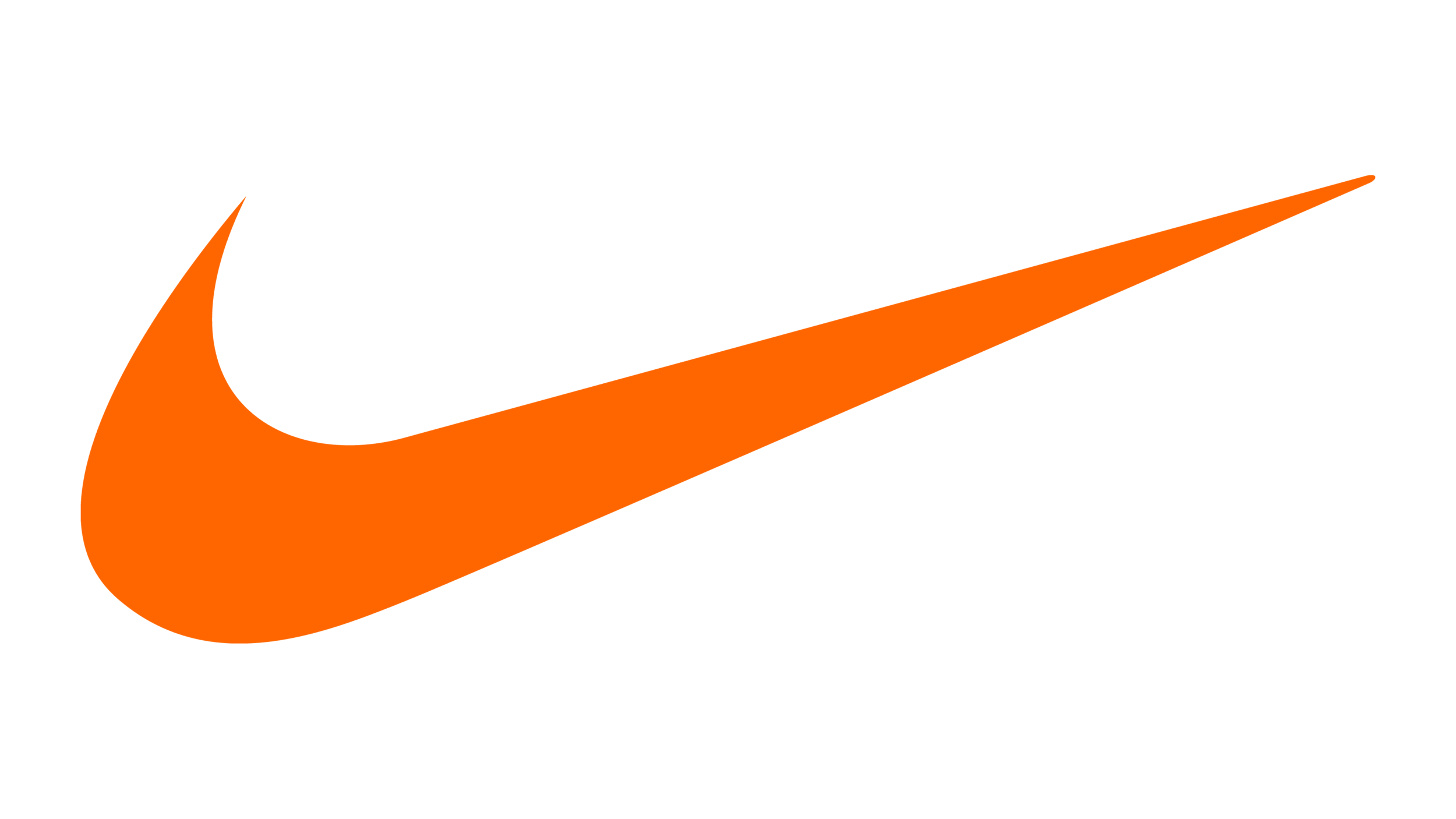
We saved the best for last, in case there are still doubts. Can the humble line art be an effective branding visual? Well, the Nike logo is a $34.8 billion image.
Although it looks like a simple checkmark, the college student who designed it meant for the minimalist line art logo to represent something more profound. The wing of the Greek Goddess, Nike.
With a single smart stroke, Nike has built an identity that’s impossible to forget. The brand has always been associated with athleticism, power, and speed. But for many, it also represents courage, adventure, and determination.
Carolyn Davidson designed the logo for only $35. But she was later given 500 shares of the company, estimated to be worth $1,000,000 as of 2015.
If there is one lesson to be learned, it is to never underestimate the simplicity of line art.
From double meanings to suggestive references, line art logos can uniquely position a brand. But only when it’s designed thoughtfully.