
10 Advertisements Inspired by Line Art

© Alex Trochut
The Blombos Cave in South Africa is home to the earliest drawing made by a human and engraved stone tools from 100,000 years ago. They mark the beginning of human creativity, culture, and expression with the most basic element in art — lines.
Not surprisingly, line art is still relevant today, adding depth and sophistication in self-promotion and publicity messages. Though simple, they never fail to tell a complete story that’s loaded with emotions. Oftentimes, they’re also persuasive enough to change minds and set off mass shopping sprees.
What is Line Art
Fundamentally, line art is just an illustration style using different types of lines to represent subjects on plain backgrounds. The lines become the focal point of the visual and direct the eye. There are usually no details in a line illustration but it stands out nevertheless because of the negative space.
In recent years, the dramatic use of colors, sounds, animations, and expressive lines have elevated modern line art. This has allowed minimalist line art to become an effective advertising tool.
What Line Art Can Achieve
Though minimalistic in nature, lines and strokes can represent every single object in real life when used with precision.
But it often goes beyond the basics to demonstrate complex concepts such as emotions, speed, gender, seasons, mood, mystery, class, and more.
A curved line can form a ball or it can illustrate the silhouette of a woman. With the help of animation, a few straight lines can transform into a gush of wind. The possibilities are endess and it only takes a creative mind to embody a brand in line art.
The following are just a few advertisements using line art to promote renowned brands from all over the world in new and unique ways.
How 10 Advertisements Used Line Art Creatively
1. Sidaction (by Playground)
The Company
Sidaction is a French non-profit organization established to fight against AIDS by raising awareness and organizing fundraisers. It supports programs for scientific and medical research, education, prevention, and supports people living with HIV.
The Campaign
The video ad explains how love is the catalyst for people building extraordinary things and bringing new lives into the world. It then shifts to the reality of love being a factor in contracting HIV. The ad proceeds to suggest that the same love can also eradicate AIDS. It ends by asking for donations to support AIDS-related causes.
The Role of Line Art
This one line illustration artistically expresses love, life, fragility, and pain as it takes us on a journey, shifting from one narrative of love to the other. The line is contextualized by chalk writing to represent childlike innocence and humanize HIV victims.
Red is also symbolic, as red ribbon is the universal mark of AIDS awareness and support for people living with HIV. The versatility of one line art is demonstrated at the end of the video as it forms AIDS logo, the red ribbon.
The combination of music, animation, and the voice of the narrator enhances the single line and effectively appeals to the audience’s sensitive sides to donate for the cause.
2. Amazon Web Services (by Amazon)
The Company
Amazon Web Services is an Amazon subsidiary offering cloud computing platforms and APIs that you pay as you use. It’s an entire virtual environment that lets you select the operating system, programming language, web application platform, database, and more for your application.
The Campaign
This is an explainer video for AWS, educating about its features, how to use the service, and what’s in it for the user. Weaved subtly within the explanation is also content that promotes the service. The video is quite long going over the 3-minute mark, but it still manages to engage its audience.
The Role of Line Art
AWS uses thin outlines creatively to represent the digital environment. Curved lines outline clouds in the sky, straight lines form buildings, and broken lines depict a rocket trail. The line is also an important symbol of connectivity and data transmission.
The ad also uses clever symbolism. A paper plane transforms into a rocket to demonstrate the strength in moving existing applications to cloud. Amazon has kept the animation simple and the background music is soft to help listeners understand and process the information-heavy ad.
Simple explainer videos can still provide plenty of room for branding, despite using minimalist line art. Amazon’s corporate colors create contrast, where the orange stands out from the navy-blue background.
3. United (by Shantell Martin)
The Company
United Airlines is about connecting people but it’s also on a mission to do good in the air and on the ground. Its aim is to make the world a happier, greener, and more inclusive place for everyone. It recently partnered with Shantell Martin to promote the Her Art Here contest. It was developed to provide underrepresented female artists a chance to have their work painted on a Boeing 757.
The Campaign
The video is one of the tools used by United to promote the competition. It explains how to enter the contest, what the prize is for the 2 winners, and what’s the significance of the contest. Martin also talks about uplifting female artists with contests like this in the video.
The Role of Line Art
Martin is first and foremost a line artist and she’s well known for her work. In the video, she’s seen drawing large murals on buildings using thick drawing markers and spray paint to promote the contest.
They showcase her own style of art using black ink on white canvas for contrast. Ubiquitous throughout Martin’s line art is faces with distinctive eyes that are unsettling when animated with a blinking effect.
The simplicity of Martin's art makes it achievable and relatable to everyone as if to echo her sentiment, “Everyone is creative. We all draw as children.” She often uses straight lines, curves, broken lines, and loops to ultimately represent art and United Airlines, connecting a global community of people.
4. Kiehl's (by Aries Moross)

The Company
Kiehl’s is an American cosmetics brand retailer specializing in skin, hair, and body care. It partnered with Aries Moross to create a limited-edition product line, promotional gifts, and packaging styles for the 2017 holidays.
The Campaign
The concept celebrates the holiday season with a brand-new look designed with creative art. In addition to unique wraps for Kiehl’s product lines, Moross also designed tote bags, make up bags, paper bags, Advent calendar, boxes, gift bags, and T-shirts with the same theme.
The Role of Line Art
Moross called into play the collage style in combining lines of different types, densities, and sizes to create a massive collection of holiday-themed artworks. Even though line art is often associated with minimalism, it’s impactful with Moross’ flawless execution of the collage.
Quite predictably, Moross picked familiar elements that symbolize Christmas and the holidays for the collection. Objects such as gift boxes, turtledoves, candy canes, and jellybeans are known the world over to evoke festive nostalgia.
The artist then used line art, transformed them into outlines, and arranged them playfully to create a sense of celebration. The juxtaposition of red, blue, and green with white is also vibrant and reminiscent of Christmas, the snow, and winter.
5. Amnesty International by (Air Agency)

The Company
Amnesty International is a global non-governmental organization focused on human rights. It conducts research and takes action to prevent and end abuse in every aspect of life. To promote its freedom candle — a fundraising campaign, Amnesty International worked with a Belgian ad agency.
The Campaign
The campaign consists of 4 print ads that visualize various types of injustices suffered by people worldwide. The prints depict a prisoner, a woman being abused, a terrorist executing prisoners, and a child soldier.
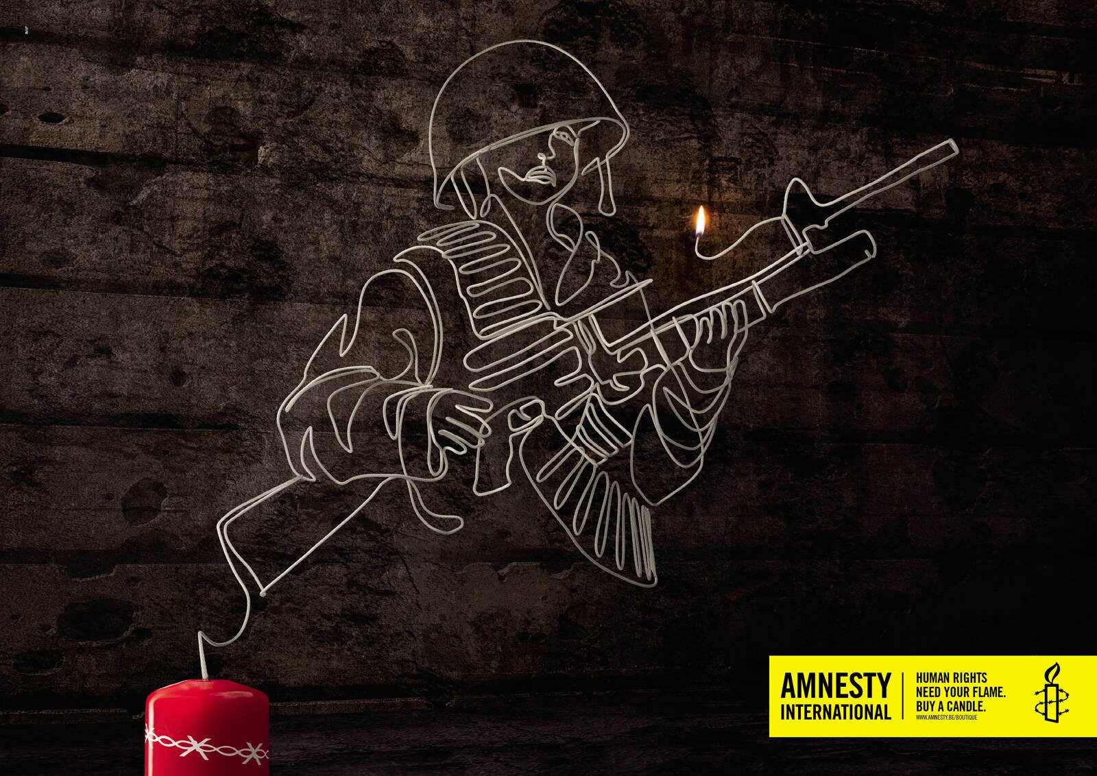
The Role of Line Art
The organization has done many campaigns to promote the freedom candle. What’s unique about this one is that each visual is created with a single continuous line leading from the wick of a freedom candle.
The graphic portrayals of violence and injustice around the world in these ads are surprisingly more dramatic than staged photography would have been. It’s also difficult to miss each subject’s emotion and circumstances, captured only with curved, straight, and thin lines.
Further adding depth to the dark theme is a dark background and Amnesty International’s iconic barbed candle. A yellow panel stands out in the bottom corner, pleading the audience to keep the flame of justice burning by buying a candle.
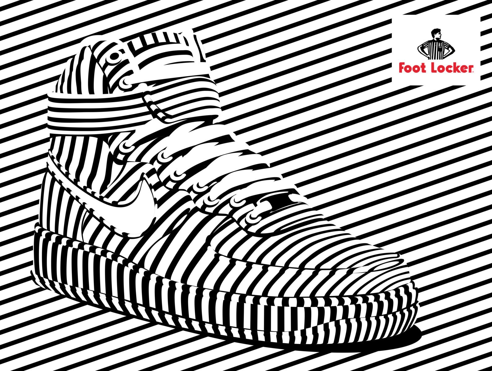
6. Foot Locker (by Alex Trochut)
The Company
Foot Locker is an American sportswear and footwear retailer. The company’s logo has gone through several iterations over the years but has always represented the sports industry. Besides a red typography, it includes a football referee wearing the distinct striped uniform.
The Campaign
A series of monochromatic ads recreated popular sneakers from Adidas, Nike, and Converse as part of Foot Locker’s promotional campaign. Although they’re singularly composed of black and white lines, the ads are not dull. They’re playful, engaging, and relevant to modern-day youth.

The Role of Line Art
This is a clever extension of Foot Locker’s identity. The artist has taken inspiration from the company’s logo and combined it with op art to create a cohesive look for the ads. In each visual, the sneaker is designed by alternating black and white lines.
It’s quite spectacular in execution especially since the background is also black and white stripes. Even when the background lines are parallel to the lines forming the sneakers, they don’t drown or cancel the other. Each has its own space to stand out.
The placement of the lines and the varying thickness are crucial to create this optical illusion. They give viewers a sense of movement despite being printed on a two-dimensional surface. Finally, the subtle shadows add a degree of realism to the sneakers.
7. Hermès by (Loooop Studio)
The Company
Hermès is an established French luxury design house specializing in silk and leather goods and lifestyle accessories. It engaged Loooop Studio to design ads and videos to promote the grand opening of the Hermès Boutique Parfum in Paris.
The Campaign
The deliverables for the campaign included a poster and 2 videos. The approach right from the start was to elevate Hermès style using minimalism. The line artist picked simple perfume bottles, flower motives and a white background to announce the opening of the boutique. There were no clever taglines, extensive video productions, or high-fashion photography.
The Role of Line Art
A leading studio in single line drawing, Loooop combines organic one line art and animation to express Hermès’ superior craftsmanship and creative freedom. Just like Hermès prides in handcrafted perfection, so too does Loooop in drawing by hand, an elegant announcement.
The teaser videos have few but fitting elements such as bottles of perfume in different outline colors, flowers, and a ‘coming soon’ script. They don’t contain any background music, just the sound of a pen scratching paper as the illustration comes to life.
What’s really inspiring is that even Hermès’ logo is recreated with one line art. At a glance, the posters may seem like abstract drawings. But they’re linked to Hermès with the accouterments of the fashion world.
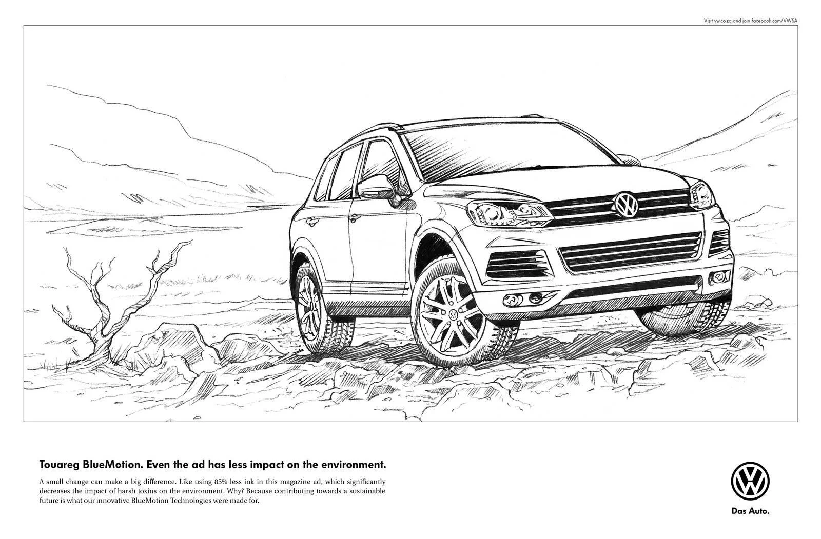
8. Volkswagen (by Ogilvy)
The Company
Volkswagen (VW) is a well-known German motor vehicle manufacturer. It introduced BlueMotion technologies in 2006 to increase fuel economy and reduce emissions. This feature was highlighted in all Touareg BlueMotion ads.
The Campaign
This is a print ad for a magazine in South Africa with a visual of Touareg BlueMotion in what’s presumably an African landscape. Instead of relying on costly photography and clever play on lights to emphasize the vehicle’s style and versatility, the artist decides to take a minimalistic approach with a black and white drawing.
The Role of Line Art
The monochromatic ad encapsulates VW’s vision of reducing impact on the environment with BlueMotion technologies. It does this by using 85% less ink compared to a traditional full color ad.
The ad is constructed entirely with line art drawing and captures a rough terrain surrounded by mountains, a rocky path, and a barren tree. Open to anyone’s interpretation, these elements could be hinting at the versatility of the Touareg BlueMotion or the car’s adaptability in the African continent.
This is a brilliant ad to prove you don't need stylish photography or CGI to demonstrate what an eco-friendly car can do. With creativity, a few simple lines can emphasize the point. Finally, a short caption neatly ties the visual with the technologies that elevate the car.
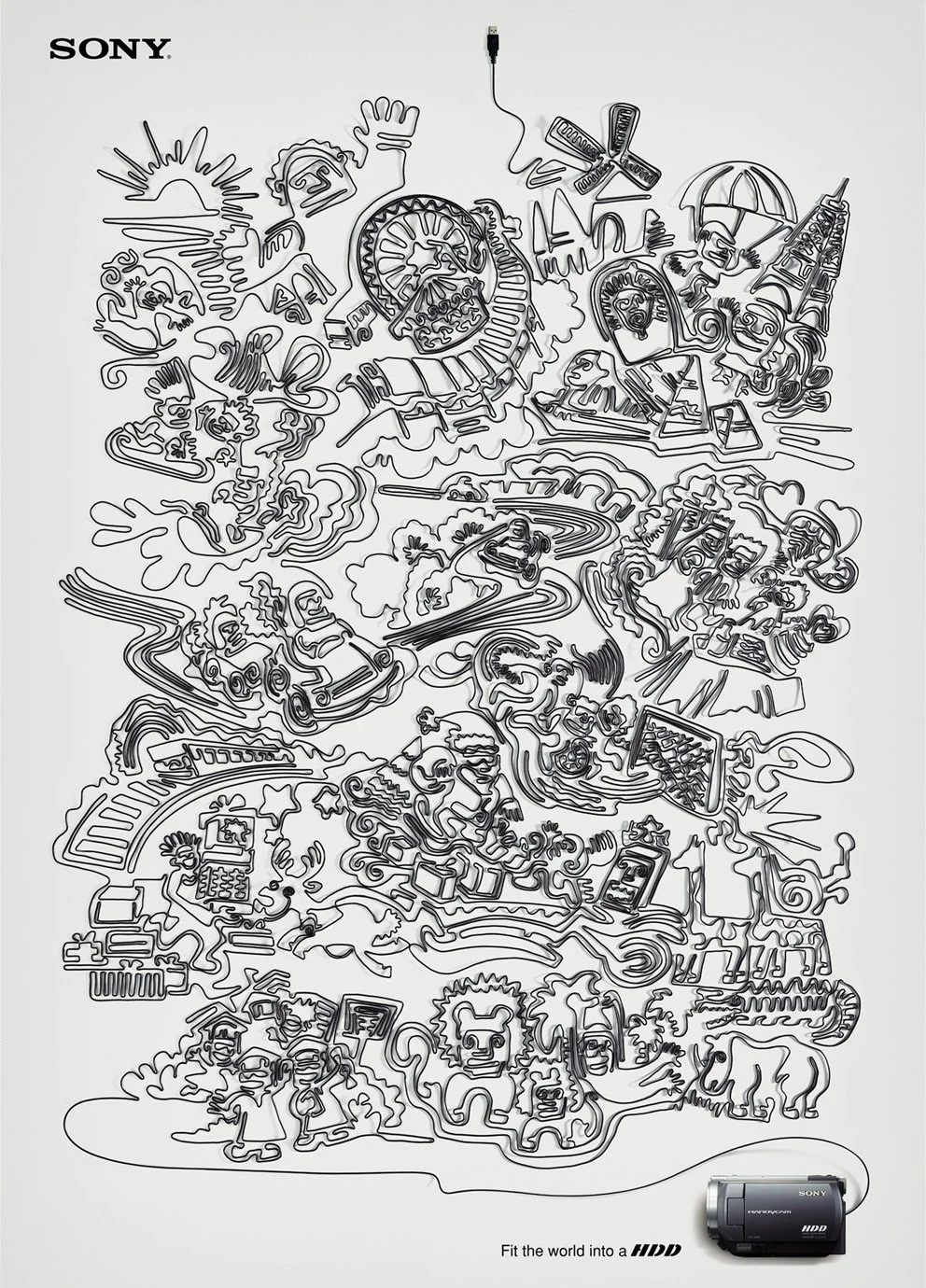
9. Sony (by Wunderman Thompson)
The Company
Sony is a major Japanese conglomerate engaged in the development, design, manufacture, and sale of electronic devices, gaming consoles, and software. One of its products include HDD camcorders that allow recordings to be stored and copied from its hard drive.
The Campaign
The print ad campaign is titled 'Line' and it promotes Sony’s HDD camcorders. The design is formed with one line originating from a camcorder and uses just black and grey to convey its message.
The Role of Line Art
This is a busy print ad constructed with single line drawing, camouflaged by a USB cable connected to a camcorder. It’s a jumble of snapshots depicting various life adventures such as a man with a parachute, a race track, a variety of animals, the pyramids, and more.
It’s a creative ad that demands more than a cursory glance. Follow the line, and you’ll see every experience and choice that form our memories, the story of who we are. What pulls the ad together is the short caption, ‘fit the world into a HDD’.
With a single short line, the ad offers the option to store a world of life experiences in mere memory or immortalize them in HDD.
10. Guuk (by Jonathan Calugi)
The Company
Guuk is a telecommunications company based in Basque Country. Its aim is to connect people across the globe. The company engaged Jonathan Calugi to create a series of illustrations that feature the connecting of 2 points.
The Campaign
The media for the campaign includes TV ads, bus wraps, posters, GIFs, building wraps, and an animation of Guuk logo. The campaign focuses on human interactions and the role of technology and the internet in bringing people together.
The Role of Line Art
Calugi uses continuous line drawing to send different messages about connecting with people, internet connectivity, and device connections. These relate back to Guuk and the services it offers in Basque Country.
The outcome is a cohesive look and feel in all the medium, with thin lines transformed into a human, sheep, trees, cloud, or the rain. With the help of animation and morphing, a simple line art can demonstrate speed or the communication between 2 people with mobile phones.
The overall look is clean and minimalist in nature with a white background and black line, punctuated by green elements for contrast. Incidentally, green is also Guuk’s corporate color.
Final Thoughts
As we’ve seen, line art is versatile enough to represent any concept or object we’re accustomed to. It can be tweaked to be playful like the Sony ad or communicate serious matters like the campaign for Amnesty International and Sidaction. The simplicity of line art is its very strength in constructing powerful advertisements.